ChefSteps

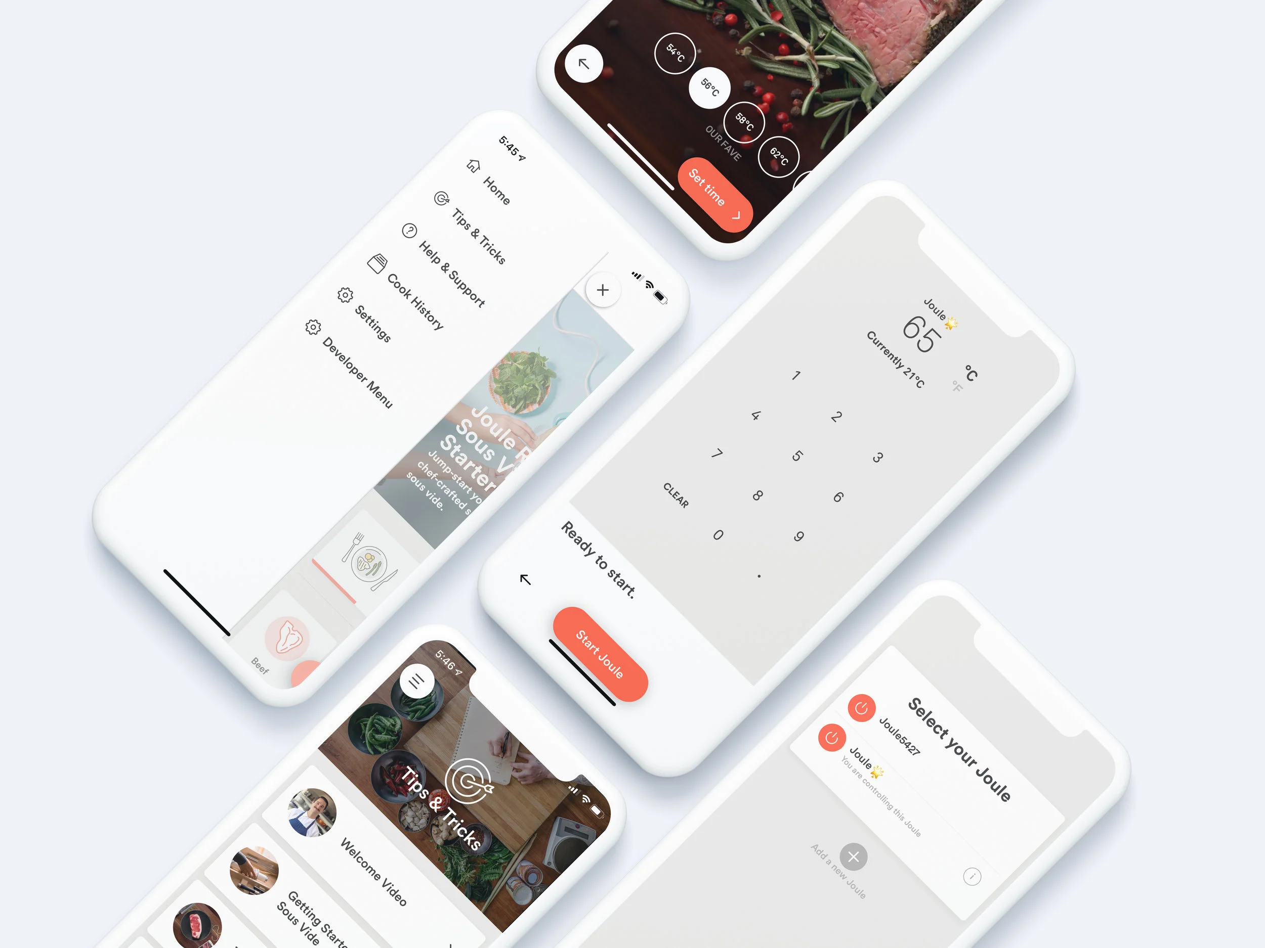
I was the original designer of the Joule app. Designed to both be an expert controller of the Joule Sous Vide and a first-rate cooking app, it innovated in several important areas: video and control of a powerful kitchen tool over Bluetooth and Wi-Fi.
I wanted to apply ChefSteps’ James Beard Award-winning video talent to teaching people how to cook. This made video and imagery central to the user experience, with many core views being wholly taken up with autoplaying video. Thus, the UI had to get out of the way and float just above imagery. New processes and ways of shooting video had to be invented, allowing us to capture key cooking instructions that can be digested in just seconds, all while leaving room for the user interface elements what would be present for customers.
What I did: product strategy, UX design, UI design, user testing, front-end coding, some dumber Javascript feature work, project management, art direction, you name it.
Also with Luke Clum. Download the app.

“Guided Cooks” or cooking from a guided recipe, was one of the more ruthlessly user tested and polished sequences in the Joule app. It was part of the “Ah-ha!” moment, along with the first time a customer paired Joule to the app, that makes Joule a joy to use.
It was my vision that the Joule app would be the best cooking app in the world that you could use with just one hand. Vertical orientation being the most natural, it was clear that shooting and supporting vertical video was essential to this vision. Instruction would be provided in brief video loops, and Visual Doneness (seen in the center-most screenshot above) was a feature that most demanded video: how “done” something is isn’t merely an aspect of color, but also of texture, which cannot be well shone statically.
While the aesthetics of the app have changed some over time, my central concept around how to interact with a recipe that literally controls a cooking tool has remained the same, albeit polished and refined through millions of cooks and hundreds of thousands of customers.
Also with Luke Clum.

Our keypad temperature input was an early innovation that made setting a temperature with Joule fast and easy. Other apps had resorted to the scroll wheel—and inelegant solution for precise control.
Throughout all iterations of the design of the app, I strove for a clean and elegant aesthetic that was both purely utilitarian and easy on the eyes.

Visual Doneness™ is a revolutionary feature for sous vide cooks. Using video, customers can preview what their food will look like before they cook it. Sous vide makes outcomes very predictable and the parameters given to the Joule Sous Vide through this interface assured perfect results time and time again.

Joule app integration with ChefSteps’ Joule Ready product meant that customers always had a helping hand in preparing their meals.


Steak Visual Doneness. We had to invent new video production processes to accurately—and attractively—capture varying degrees of cooked for steak and more than 100 different foods.

Burgers. What you see is what you will get.

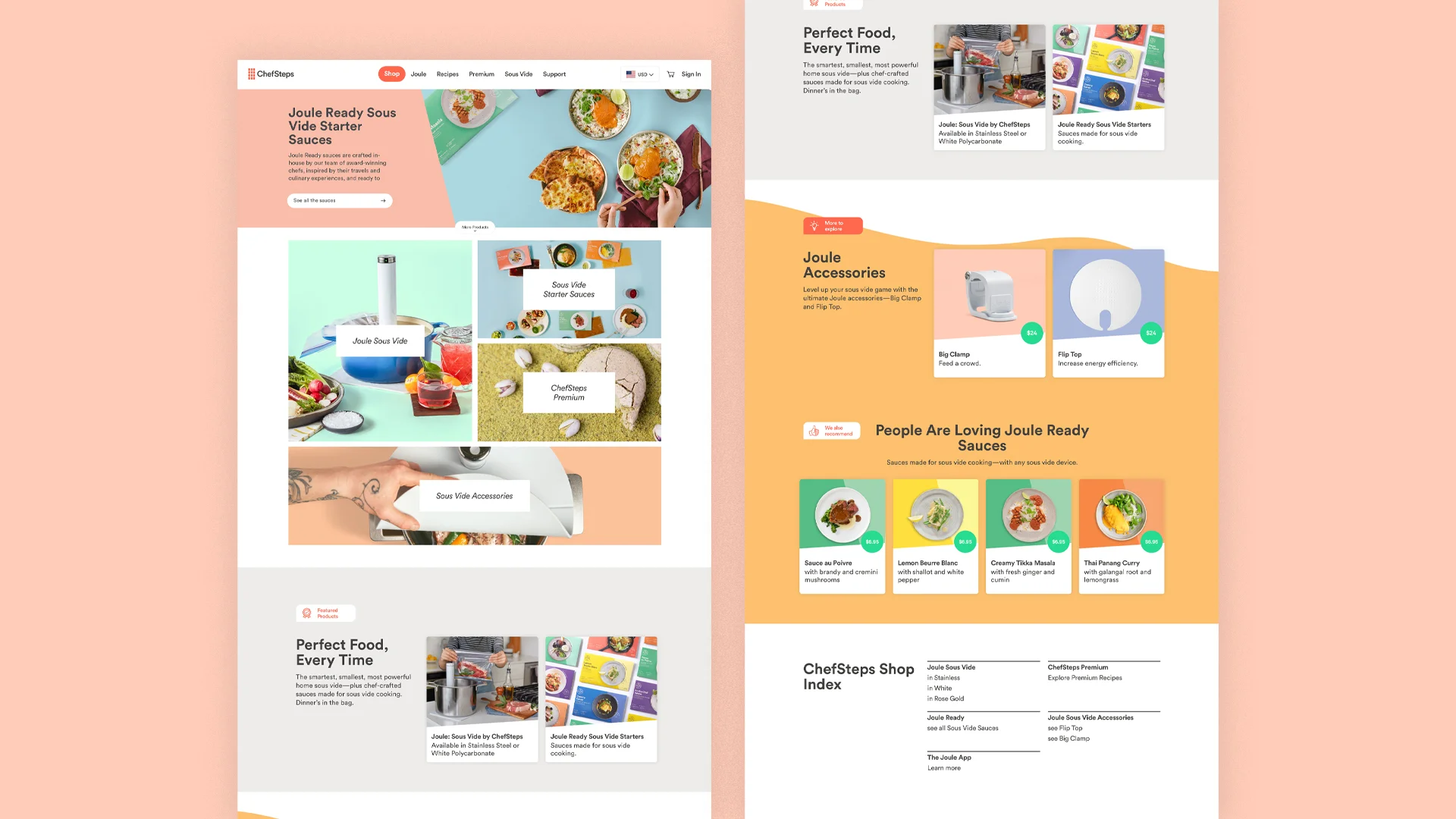
Launched in 2019, the ChefSteps Shop serves as a hub for discovering the various different products for sale on ChefSteps.com. Built on the Spree e-commerce platform and editable by a content management system, this hub was designed for ChefSteps to best address the customer and business needs of direct sale online retail.
What I did: UI design, UX design, content strategy, CSS.


